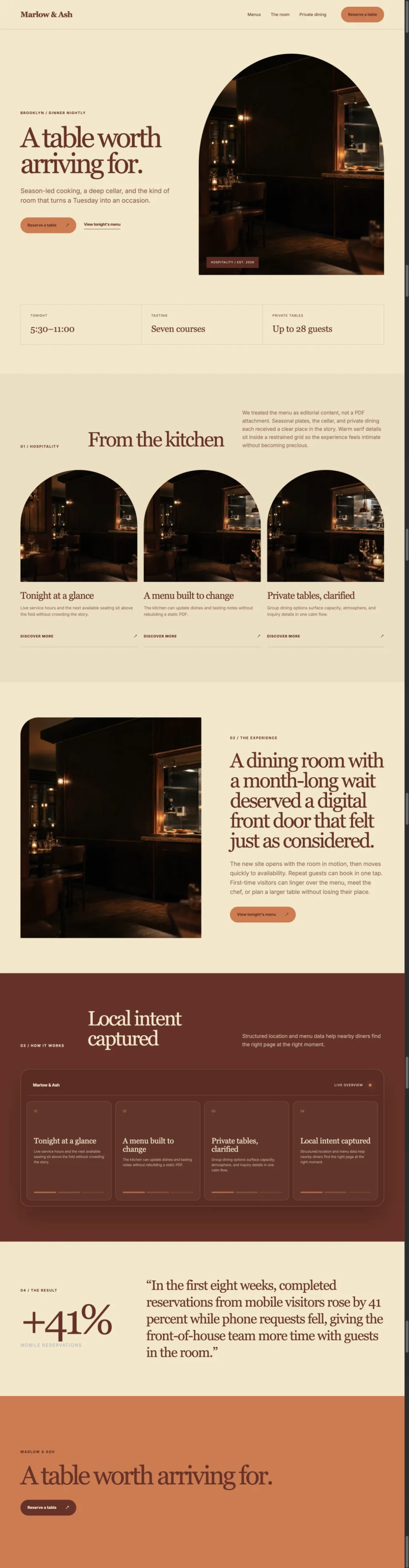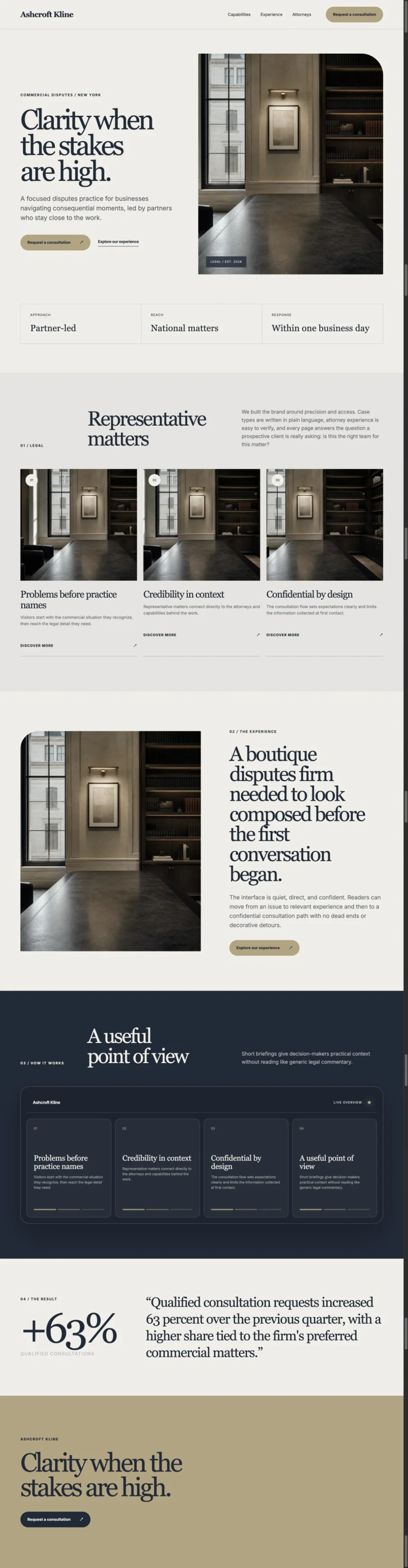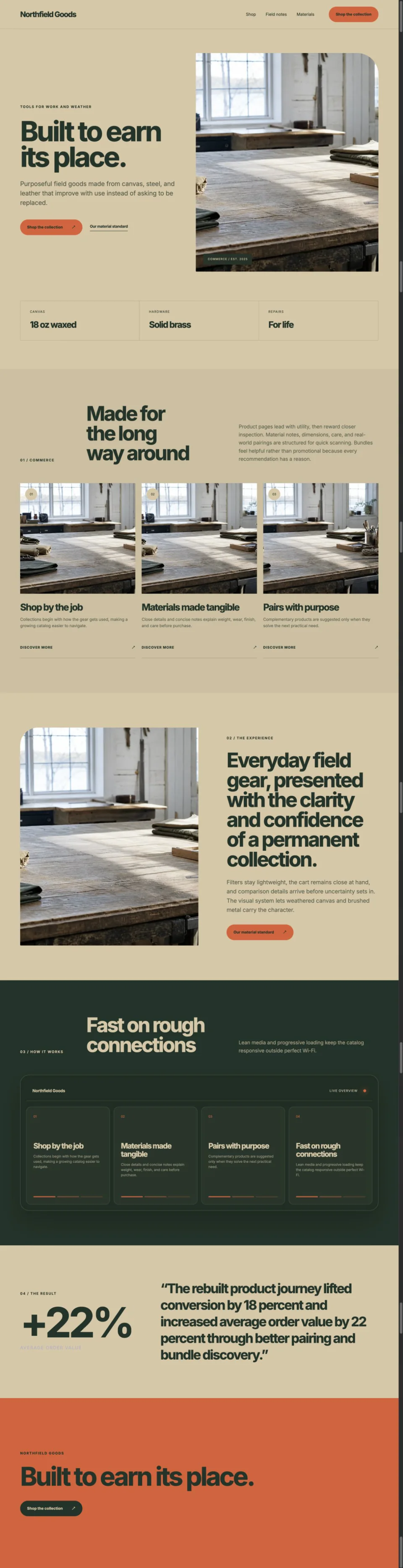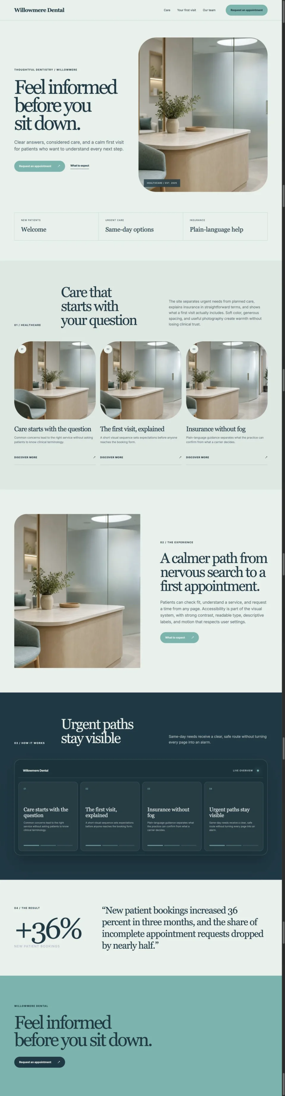
Responsive sizing, art direction, and compression can preserve both speed and visual intent.
Serve the right dimensions for each layout, use modern formats, define image space before loading, prioritize only the main visual, and judge compression at the final displayed size.
Design the crop as part of the component
A desktop photograph and a narrow mobile crop often need different focal decisions. Art direction prevents the browser from shrinking the wrong composition.
Do not send invisible pixels
A small card should not download a full hero asset. Responsive source sets let the browser choose an appropriate file for layout and device density.
Protect layout before the image arrives
Width, height, and aspect ratio give the browser space to reserve. That prevents content from moving when media finishes loading.
Questions that follow.
AVIF and WebP are strong for photographs, while SVG suits code-native vector artwork. Keep a compatible fallback when your audience requires it.
No. The main above-the-fold image may need priority. Lazy load media that begins outside the viewport.
The source may be too small for its rendered size, the crop may be scaled, or compression may be too aggressive for detailed texture.